Fig. 1, above: Showing (38mm dia) bottle top differences from the side.
Home Go back.
This page has information about typologies which relate to the artefacts of the peripresent (if that wasn't a word, it is now). The idea here is to identify common items used in modern life, and any design variations these might have seen over the years. Eventually, a timeline of these variations can be created which can be used to date them (relatively), and help to date the contexts in which they might be found in the future. If most of the things here relate to food and drink, it's because the high rate of production/use/disposal of these items is likely to be represented well in the archaeological record of future contexts. The FATCat started with an accidental comparison of milk bottle tops, before I decided these were probably quite a good type example. Milk bottles have been a staple aspect of modern Western society for a very long time, and the design has been optimised many times over many years.
Contents:
Plastic milk bottle tops (U.K.)
In the early 2010's, the design of supermarket milk bottle tops changed. Most PeopleTM probably didn't notice. The change came about after one of the key industry manufacturers (Portola) decided to reduce the amount of material used in producing milk bottles. Portola was bought by Silgan Closures (now Silgan Plastics) in 2013, and the changes started to take effect around this time. At the same time, farmers started complaining that producing milk was expensive. By lightening the composition of the bottle, cost savings could be made and the amount of resources per bottle could be reduced, lowering costs along the way. The design has since evolved into the top found in fridges today across the land, via an intermediate design which seemed to last for a number of years. This composite included features of both the original design and those which were to be carried forward. The main change was a reduction in the density of the plastic, which would also improve the efficiency of the key Lifecycle Processes (production and recycling).
In attempting to create some kind of timeline relating to these bottles (and lids, or more specifically, closures), the following questions have arisen:
1: Are bottles supplied to dairies pre-made, or are they made at the dairy?
2: Are the bottles (and associated machinery) cross-compatible between manufacturers? The 38mm lid diameter standard may suggest this.
3: Are dairies free to change suppliers as needed, or are they subject to contractual restrictions?
4: Why did manufacturers change from a paper label to a wrap-around film label, only to change to a sticky plastic label later on?
Thinking about question 1 above, supplying pre-made bottles seems, on the face of it, a massive waste of transport space considering their volume. Empty plastic milk bottles are also probably the most fragile things ever made (after aerogel, and the hazard light switch on ~< 2004 Ford cars).
There are two key manufacturers of these bottles (and lidsclosures) in the UK: Portola (later Silgan), and Nampak. Here is a brief timeline of events in the Portola history book, taken from surviving parts of their website (saved by the Wayback Machine on the Internet Archive):
<2013 Lids are dense plastic (weighing 3.5g), with a variety of sealing methods.
21/08/2013 Portola releases a press release about their new Eco range of lids, which aim to be cheaper to make.
22/08/2013 Press release about their new foil seal, which has been added to their easygrip product (featured in the Eco range).
13/10/2013 Press release confirming the new lighter lid for the UK dairy market, and the revised weight of 1.3g. It also "enhances the consumer experience" somehow.
08/02/2014 First mention of the Silgan takeover on the Portola website.
10/08/2014 Website logo changed to Silgan to reflect new ownership.
04/05/2021 Silgan lids paired with bottles made by Blowplast Ltd.
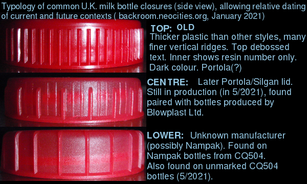
A picture showing a side view of some of the changes in lid design is shown below:
Fig. 1, above: Showing (38mm dia) bottle top differences from the side.
Figure one above shows the chronological changes in design of typical 38mm Portola (later Silgan) milk bottle lid, as viewed from the side. Other changes relate to the colour, which becomes more translucent in the intermediate and later designs. The material is also noticeably less rigid than the (top) top [this could get complicated...]. From above, the text design also changes. The text in the old design is heavily debossed, using a relatively standard font similar to Freesans/Helvetica. The inside of the old design shows only a resin number, although I recall some initially displaying the name "PORTOLA". In later years this would be followed by a website (portola.eu.com, or similar). The later (~2009 onward) design features lightly debossed text on top (narrow font style similar to DIN 1451), with resin number and possible product/moulding code. Lastly, the third type features slightly heavier debossed text (using Arial bold typeface). The inside once again reverts to a resin number only. The manufacturer of this third variety is unclear, although they were found on bottles made by Nampak (who do also make lids). Whether the dairies have standardised on a single manufacturer is also unclear at present (there may be other geo-economic factors at play which provide a much simpler explanation for the variations I hope to demonstrate).
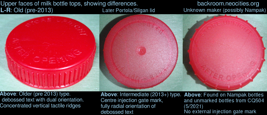
Fig. 2, above: View showing bottle top differences from above.
Figure two above shows the external differences visible from above, namely the text style and overall design progression. There is an injection gate mark on the later Silgan design which is curiously absent on the other types. The internal differences are shown in Figure three, below:
Fig. 3, above: View no longer showing internal differences.
The internal differences shown above indicate a decision to begin, then stop, displaying corporate website information (visible on the later Silgan deisgn only). This isn't yet a clear-cut characteristic of the three main types, as there are a number of different manufacturers of these lids. The injection gate mark is also visible on the intermediate type, along with other proprietary information.
The study here assumes the majority of the tops will have been made by Portola/Silgan, or any iteration of those organisations (Silgan has quite a few internal sub-divisions, as of 2021). The unmarked lid could be produced by Nampak as they have, to the extent of this study, only been found paired with Nampak bottles (either marked or unmarked). Other moulding suppliers exist (such as Massmould, Blowplast, etc), which I intend to include here at a later date. Massmould produced the plastic lids for Marmite, and were acquired by RPC-Bramlage in 2016. As of 2019, Marmite lids were still marked "MASSMOULD", so only time will tell if this will change. My rate of Marmite consumption is so slow that finding out the messy way could take some time, but more research is needed.
The waters are muddied further with the addition of the manufacturer Nampak, whose take on the milk bottle market seems to be increasing. The fact lids are mentioned on their website (as of 2021) seems to suggest they may make the bottle/lids as a complete package, although whether dairies use other lid suppliers is another question.
On 15th march 2011 Nampak were granted a patent (number GB2470316) for a type of milk bottle design that seems to have fallen out of use, although these are identifiable by the patent number moulded into the base of the bottle. More information about this is available on the UK Intellectual Property Office website. These bottles are fairly distinctive, as their moulding is split from corner-to-corner as opposed to face-to-face. One of them is shown in Figure four below:
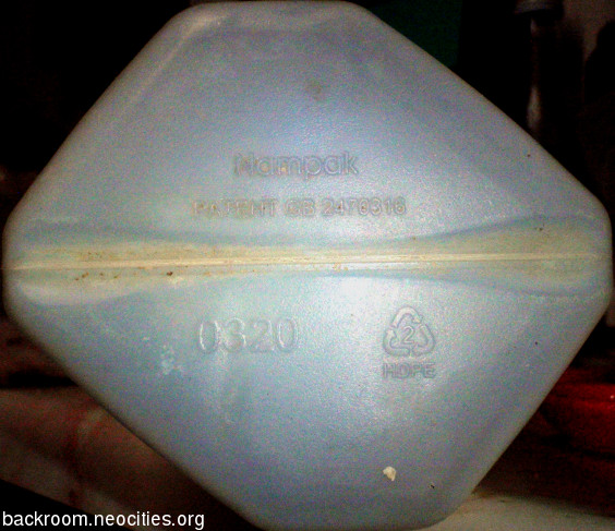
Fig. 4, above: View showing Nampak patent milk bottle type.
Since around 2019, there seem to be two different logo styles used on Nampak bottles. The typical "Nampak" word seems to have been used interchangeably alongside a newer, square logo which I've only found once so far. The typical word logo is shown in Figure five, below:
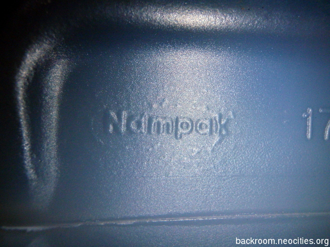
Fig. 5, above: Showing the Nampak word logo.
The bottle shown in Figure five above was purchased in February 2021 from Lidl (other supermarkets are available...), and the dairy establishment code was CQ 504 (Trewithen Dairy). This logo has been found in the same form on bottles dating from 2010, and is still in use. The bottle with the square logo shown in Figure six below originated from the same dairy in around 2019, suggesting that the dairy might be in the process of updating some machinery to that which bears the later logo mould.
At least one dairy (in this case Trewithen, CQ 504) has started using bottles with no manufacturer mark at all. This change was first noticed on bottles for full cream milk (March 2021), but at this time bottles for skimmed were still carrying the logo. Marked skimmed bottles were observed with use by dates of 6/4/2021, and a use by date 7/4/2021 with no mark. This doesn't reflect the actual changeover date as the machine adaptation process probably takes some time, but it should serve as a useful indication as to when Nampak started to remove the old-style wordmark from bottle moldings. It will be interesting to see if they begin to reuse the new mark, first seen in 2020 and shown below:.
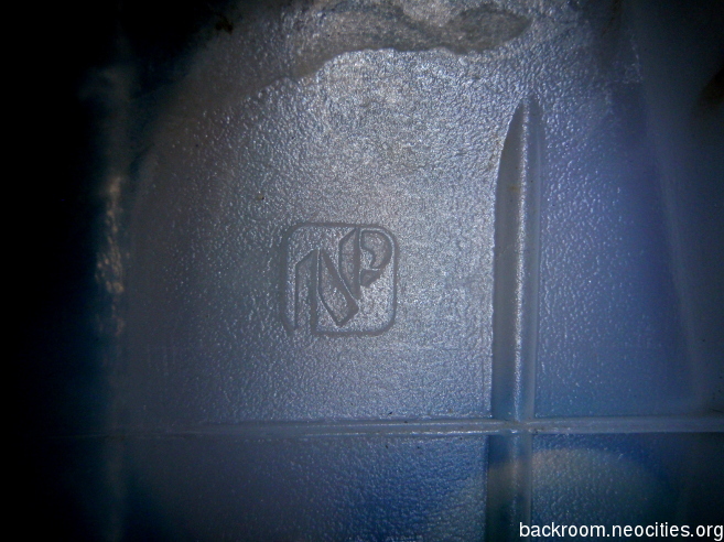
Fig. 6, above: Showing the Nampak square logo.
Some updates for 2023:
At around the end of June 2023, I noticed bottles from the Trewithen milk processing plant (CQ504) had clear-white caps across the three main supermarket milk types. For some time, the colour themes (skimmed=red, semi-skimmed=green, whole=blue) have been applied to the label overall, so the colour of the lid is almost irrelevant at this point. The lids being a universal colour probably aids recycling, as prior to this point the coloured tops were the only coloured parts of the plastic whatsoever (aside from the label). Eliminating colour (aside from the label itself) means the recycling system for these containers no longer requires the logistical complexities involved in processing three different colours of plastic. As a result, I don’t see the coloured lids making a comeback in their original form. Shown below is a comparison of the recent clear-white lid with a similar lid (using Calibri text) beneath. The coloured lines of the starting 'S' indicate some of the basic differences in angles and shapes between the typefaces:
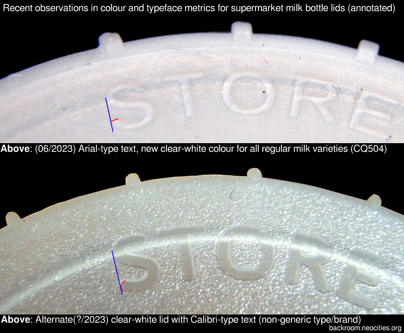
Fig. 5, above: Comparison of recent clear-white lid with Arial typeface (top) and similar lid with Calibri typeface (bottom).
As far as typefaces are concerned, recent surveillance shows the staple Arial-style still very much in use for own-brand lines. Calibri (or typeface of the same metric) has been seen, but only on lids for some specific types (some of the posh, filtered milk). It’s yet to make an appearance for the regular supermarket lids (at least, as far as Trewithen dairy seems to be concerned), but I predict this will change as molds are replaced and technology is upgraded. Calibri became the default typeface for various Microsoft products in 2007, so it follows that if a standardised typeface is to be used (with minimal licensing costs, good molding characteristics etc) then this will begin to propagate over time. (This does assume the molding designers use Windows, which they may not; other operating systems are available.)
So far, the Nampak timeline looks something like this:
28/05/1992 Registered design (no. 2023169) for a container with closure is granted to Plysu Limited.
28/05/1997 Registered design no. 2023169 expires.
??/??/1999 Nampak Plastics Europe formed by merger of Nampak's UK arm (Blowmocan) and Plysu PLC, which it bought for £94M.
15/03/2011 Patent 2470316 granted.
??/12/2019 Nampak sells Nampak Plastics Europe to Bellcave.
??/??/2020 Square Nampak logo seen on ASDA milk bottles (dairy CQ 504, Trewithen Dairy).
??/??/2020 Nampak Plastics Europe re-brands as First Circle.
20/02/2021 Regular Nampak word logo seen on LIDL milk bottles (dairy CQ 504).
02/03/2021 Nampak bottles with the 1992 design registration number are still being made, carrying a dairy-owned brand label (CQ 504).
06/03/2021 Bottles appear with no obvious manufacturer marking (CQ 504).
??/06/2023 Lids for standard milk (skimmed, semi-skimmed, whole) are clear-white, although Arial typeface remains. (CQ 504).
Sources:
Berry-Bramlage (2020) About us. Available at:
https://www.rpc-bramlage.com/en/about-us/about-us-page/ (Accessed: 3/2021).
First Circle (2020) About. Available at:
https://firstcircle.group/about/ (Accessed: 3/2021).
Gov.uk (2021) Find a registered design. Available at:
https://www.registered-design.service.gov.uk/find/2023169 (Accessed: 3/2021).
Intellectual Property Office (2021) Patent document and information service (Ipsum). Available at:
https://www.ipo.gov.uk/p-ipsum/Case/PublicationNumber/GB2470316 (Accessed: 3/2021).
Nugent, H., The Guardian (2012) Dairy farmers step up protest over price paid for milk. Available at:
https://www.theguardian.com/business/2012/jul/20/dairy-farmers-protest-price-milk (Accessed: 3/2021).
This Is Money (1999) Plysu Bought in £94M deal. Available at:
https://www.thisismoney.co.uk/money/news/article-1576524/Plysu-bought-in-16394m-deal.html (Accessed: 3/2021).
Walker, T., British Plastics and Rubber Magazine (2019) Nampak sells Nampak Plastics Europe business to Bellcave. Available at:
https://www.britishplastics.co.uk/plastics-industry-news/nampak-sells-nampak-plastics-europe-business-to-bellcave/ (Accessed: 3/2021).
Marmite
Marmite jar labelling hasn't really changed much in a long time, but several variations to both the front, top, and back label designs have become apparent in recent years. The nutrition information labelling has been moved to a peelable fold-out sticker on the lid, as opposed to the back label. The design of the back label has changed numerous times since this alteration. Recently (in the past ~3 years), the names of some ingredients have changed. Where once was "vegetable extract" there now is "vegetable juice concentrate", and other similar variations. As yet, I've no distinct dates for these changes, but I hope to add some at some point. The writing on the lower front label has been changed from "100% VEGETARIAN" to "VEGAN SPREAD", although the typeface is very similar if not the same.
I'll add some pictures of these changes when I can fix them to accurate changeover dates.
Pot Noodles
Pot Noodles have changed a lot over the years, in both the design of the pot and the composition of the contents. The brand has also seen several changes in ownership, having seen life under Golden Wonder, Knorr Naehrmittel AG (licensed to CPC (UK) Ltd), and, finally, Unilever. Figure 7 below shows one of the older designs, produced by CPC (UK). The pot shown in Figure 7 below was found in a context with crisp packaging dating from around 1997/98 (Best Before dates of 1998).
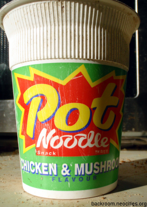
Fig. 7, above: An older design of Pot Noodle.
The ingredients have also changed, and, perhaps not surprisingly, the nutrition information. There seem to be fewer ingredients in the older version shown above, although that could be due to more relaxed labelling regulations allowing for a more generic listing of overall constituents (minus allergens etc) than would be allowed today. Figure 8 below shows the ingredients of this version:
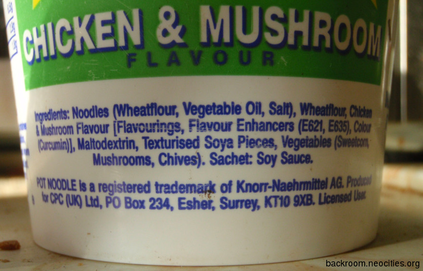
Fig. 8, above: Ingredients of the older Pot Noodle.
The nutrition information of this version is shown in Figure 9, below. This is contrasted with the nutrition information found on a modern (4/2021) Pot Noodle in Figure 10.
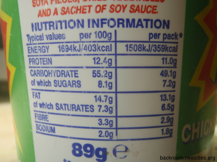
Fig. 9, above: Nutrition information of the older Pot Noodle.
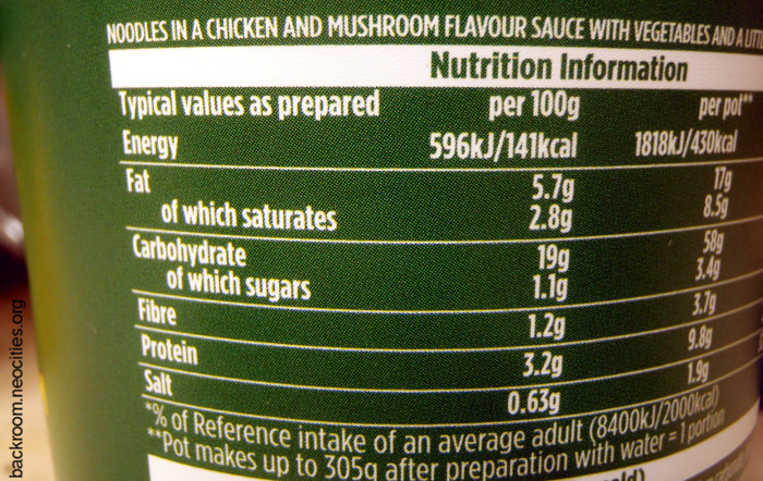
Fig. 10, above: Nutrition information of the new (4/2021) Pot Noodle.
Crisps and Snacks
This part of the FATCat is devoted to the myriad of older packaging designs for crisps and snacks, some of which have either ceased to exist, been bought out by one of the major brands, or are otherwise getting harder to find. Remember Happy Snax? Potato Puffs? (I'm sure Happy Snax were still being made in 2020). They will be here as and when I find examples of them. In no particular order, some of the others are shown below. Figures 10 and 11 below show an empty bag of Nik Naks, as the design was in 1997/98.
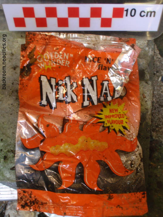
Fig. 11, above: Front of NikNaks packet from Ca. 1998.
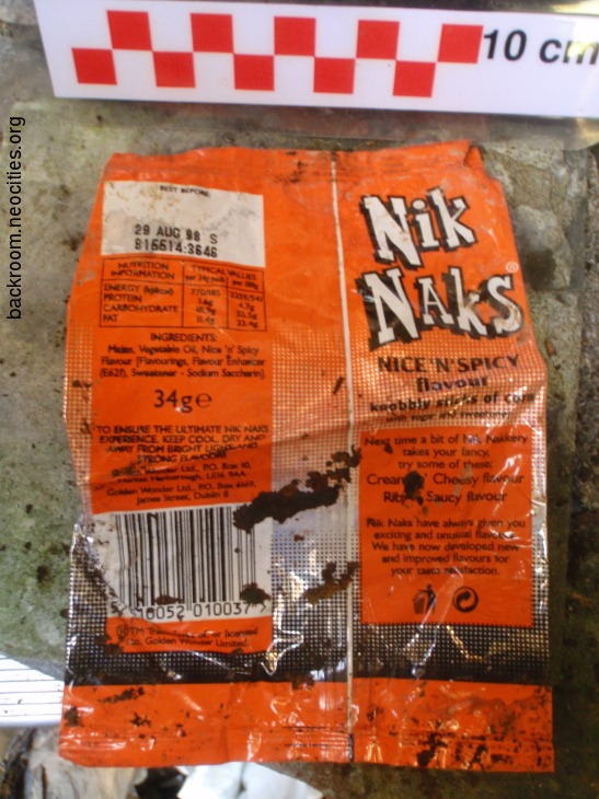
Fig. 12, above: Back of NikNaks packet from Ca. 1998.
Below are pictures of a bag of Dells Crisps, Figure 13 showing the front and Figure 14 showing the back.
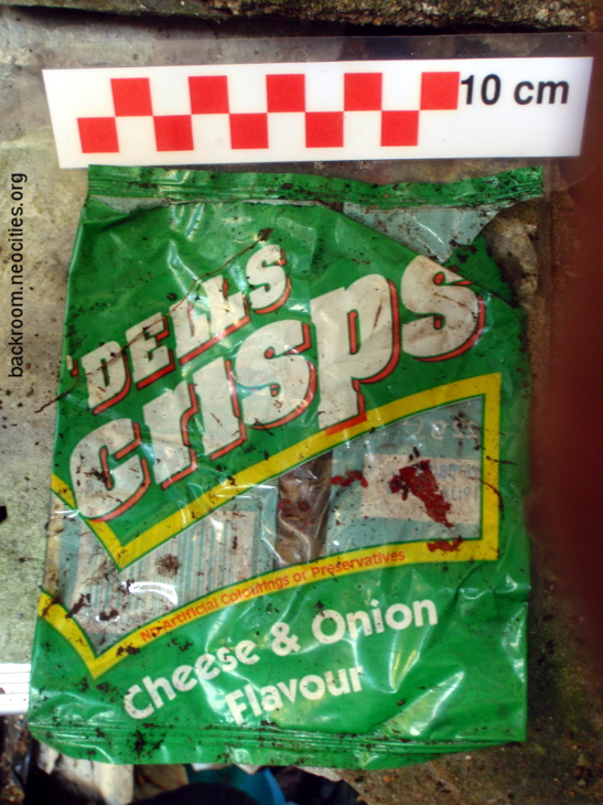
Fig. 13, above: Front of Dells Crisps packet from Ca. 1998.
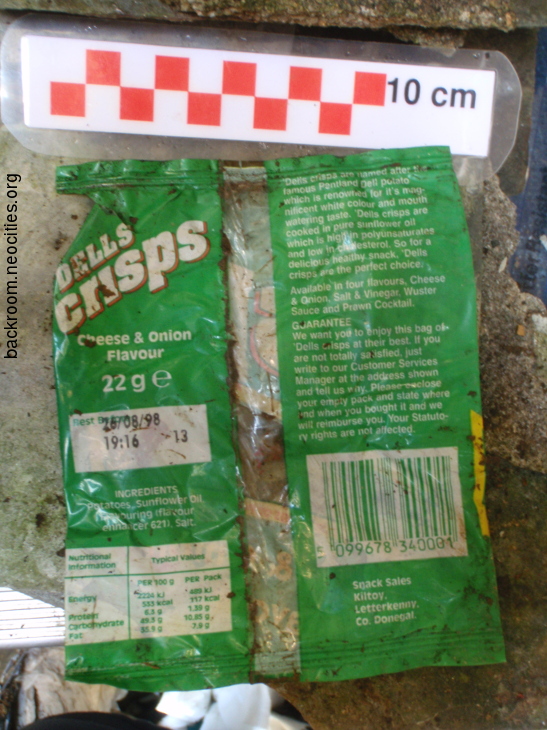
Fig. 14, above: Back of Dells Crisps packet from Ca. 1998.